Headspace
Headspace’s mission is to improve the health and happiness of the world and I was delighted to join as the Creative team lead, developing performance marketing creatives for all paid acquisition channels (Paid social, search and lifecycle email marketing) to scale business growth (40 million downloads > 90 million in two years) on top of creating brand awareness different from our competitors given our authentic expertise in meditation/mindfulness and design.
At Headspace my team and I leveraged data & research plus intuition to identify unique opportunities to market and acquire new and different people into Headspace. Our rapid experimentation lead to adaptation of brand visuals and tone of voice for GTM. We cross-collaborated with different business units from my creative team, marketing, brand, product and senior leadership.

Since day one, we’ve had a clear mission: to help anyone relax, anytime and anywhere. Soothe has grown considerably these past few years, expanding into countries and evolving our services. We wanted our design to evolve with us, too.
Our mobile devices have become our great escape nowadays. Within seconds, we can order food, find a babysitter, close a business a deal, and, most importantly, book a massage - all during a commercial break. However, sometimes companies trade the convenience of their applications for aesthetics, functionality, and usability. At Soothe, we believe that everything we produce is essential for a healthy, balanced, and active life - from the massage therapist we use all the way down to the design of our apps. Relaxation is more than an experience; it’s a journey, and to us, it begins right when you open up your mobile device.


Soothe’s first step to a more immersive experience was to develop a new logo. A logo is your visual identity, and connects you and the user to the brand. Our new logo needed to reflect strength in simplicity - something that catches and is easy on the eyes. Based on symbolism around massage and serenity, our new logo was inspired by the lumbar curve, yin and yang, and the letter S. This shape, and the movement it suggests, signify calming energy, relaxation, and harmony.
The new color palette is unique, flexible, and distinctive. It draws inspiration from the span of colors that guide us through the day, from dawn to dusk. Similarly, our typography is clean and simple, and evokes the clarity of a mind and body in sync.

Soothe sub-brand logo style

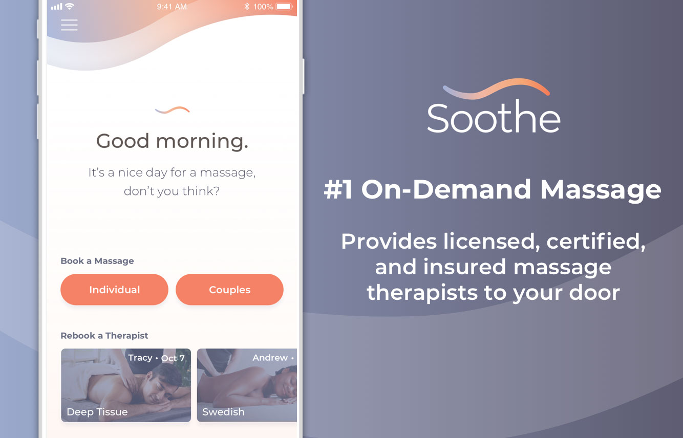
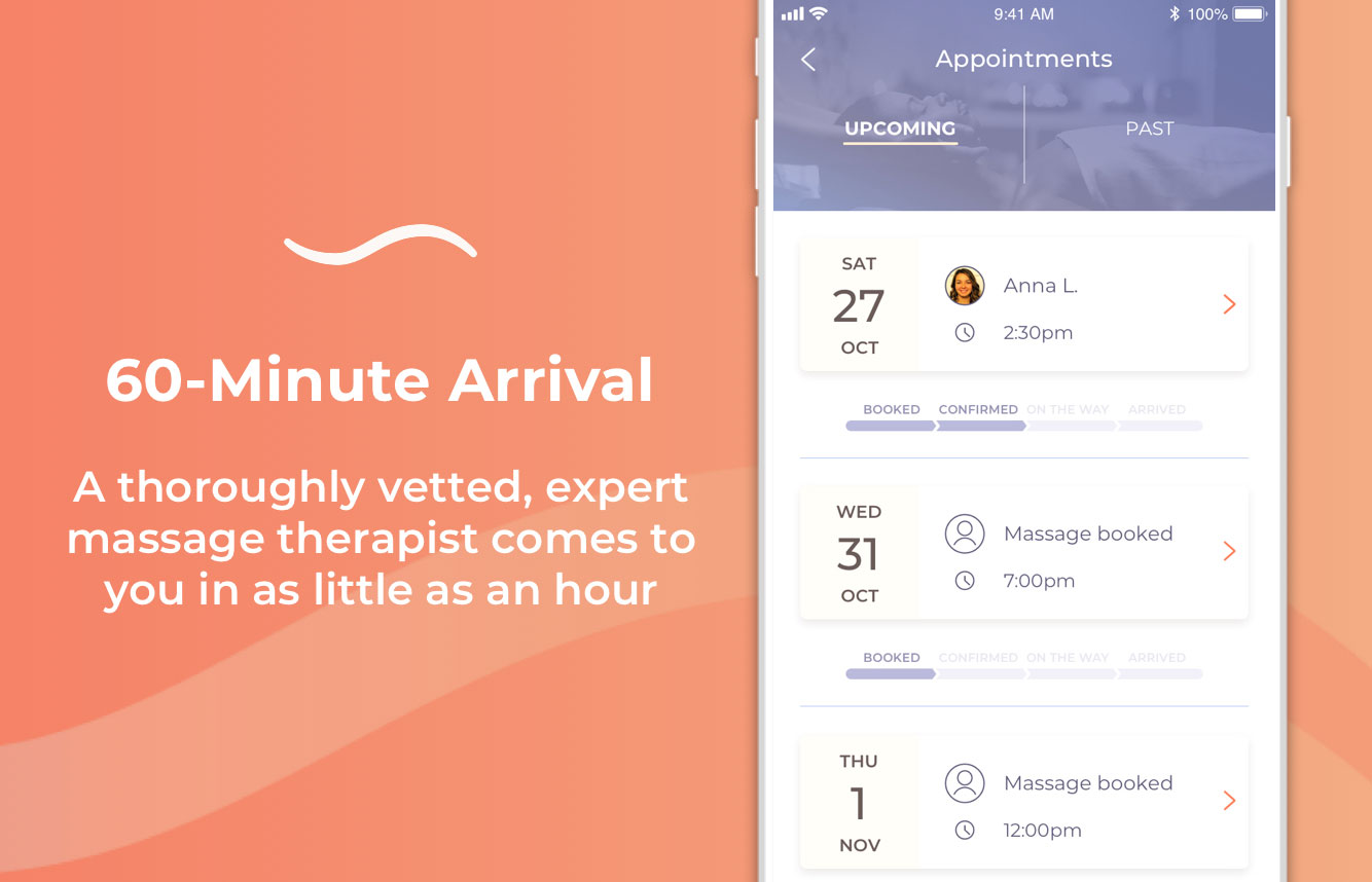
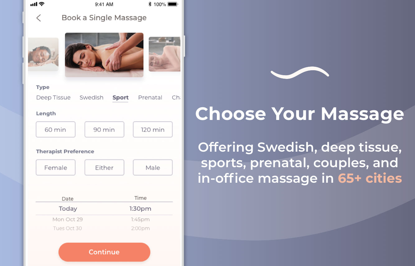
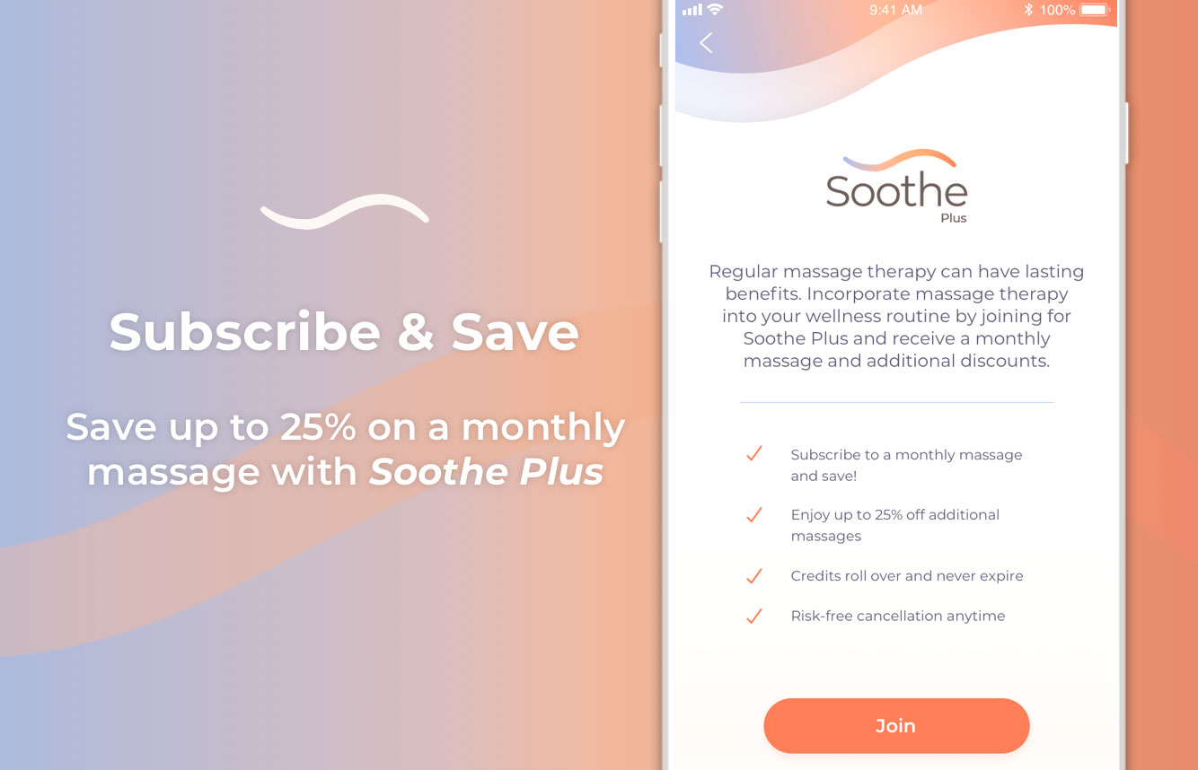
Soothe Client App on-boarding and booking flow. Creative Direction; Philip Lowe, UX Design; Michelle Matthews. UI Design; Celina Frelinghuysen
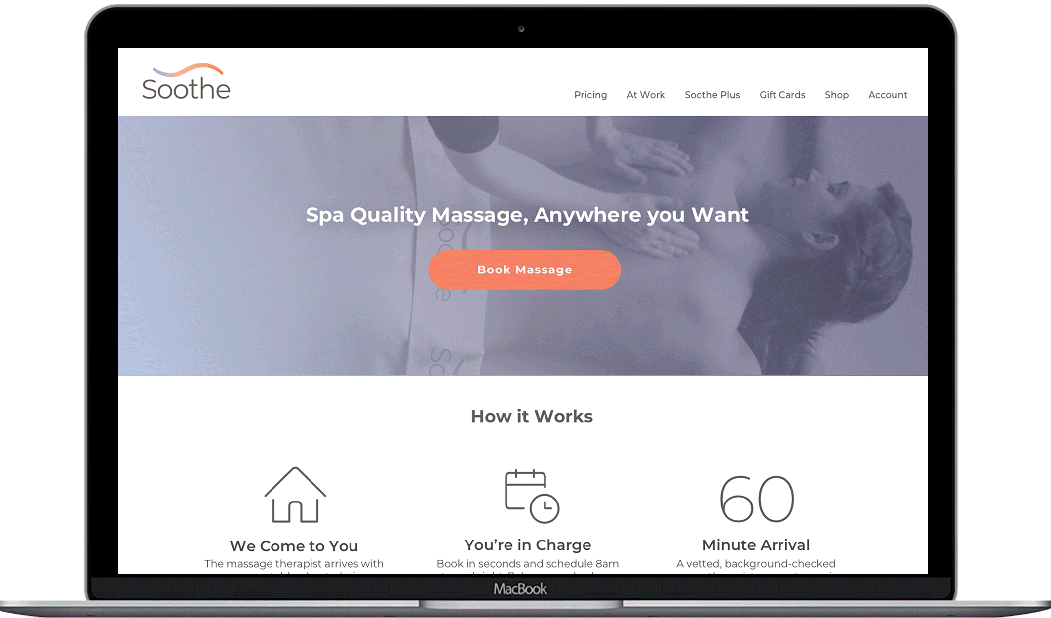
Soothe Homepage Design

Email Design

Soothe Business Cards

Soothe Massage Therapist T-shirt Design and photostyle


Soothe massage photo shoots. Directed, edited and assisted in the execution and post work done for marketing images. Creative Director: Philip Lowe, Photo Producer/stylist: Stefano Anania, Cecilia Latiolais and Jaime Daigle

Social Media Marketing Splash Screen